Growing Up Pavilion (Hong Kong)
By New Office Works

Design
This was designed by New Office Works’ co- founders Evelyn Ting and Paul Tse Yi-Pong. The New Office Work is an architecture practice based in Hong Kong. The two co- founders of New Office Works had received a lot of good experiences. Paul studied in the United States and Evelyn studied in England. They have both got a Master in architecture and also a lot of working experiences with related companies.
This Pavilion they’ve designed has won the 1st prize of Hong Kong Young Architects & Designers Competition. Not only they won this competition, they have won quite a lot of competitions in the recent years. The Growing Up Pavilion is a temporary pavilion.
The design of the pavilion was inspired by the growth of trees in the surrounding park environment.
Context
The pavilion is in West Kowloon Cultural District in Hong Kong. This is an open space for everyone to visit. This district will be developed into the world’s largest quarter, blending art, education and public space. The pavilion built in here offer a stunning harbour and sunset view as well as a space for leisure and relaxation.
The area in the West Kowloon Cultural District is big enough to hold the pavilion since the scale of the Growing Up Pavilion is quite enormous. Also, the location of the pavilion is in a silent place in the city of Hong Kong. Therefore, the space is a good choice for people to relax because in Hong Kong people are always very bust and limited of time.
Environment
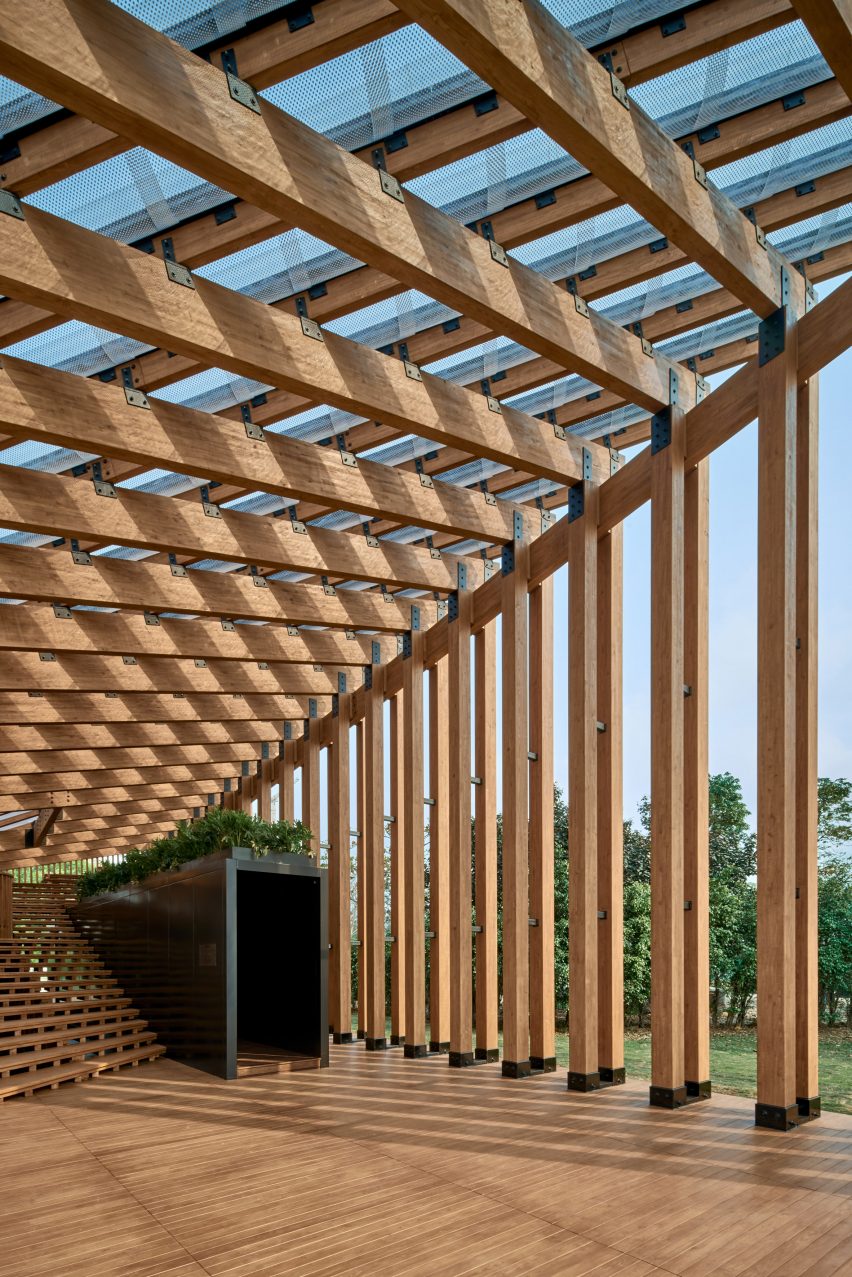
In Hong Kong, the climate is good most of the time. They get a lot if sun shine, but it also has a few rains during the week. The roof of the pavilion is designed to allow sunshine to go in while the weather is good, the roof is clear, and it is a traditional roof top as the history. There are also gaps in between the wood columns to allow sunshine to go through.

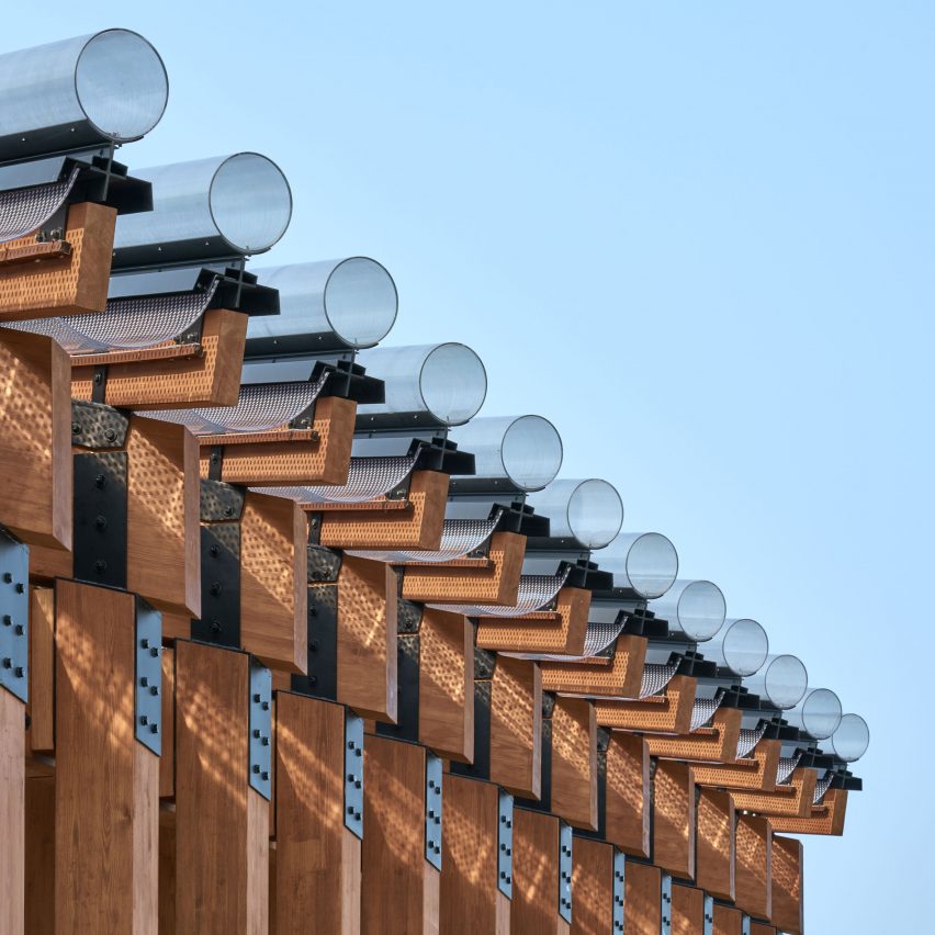
When it rains, the ‘pipes’ of the roof of the pavilion is designed to let the rain to go down to the pool that allow it the collects the water and reference to create echoes with the harbour in front. The roof is tilted to one side, so the water won’t splash into people when it is raining.

The entrance for the pavilion has a narrow alley. The narrow alley represents a symbol of Hong Kong. The narrow alley is black in the inside, but with the sunlight it is quite bright. While walking into the narrow alley, the harbour view would be attracting to the visitor as the pavilion is right in front of the harbour. The point of the narrow alley is to let visitors to see how beautiful Hong Kong is.

Sustainability
The environmental awareness in design is very high. Around the pavilion there is a Nursery Park and there are lots of plants in it. Green was a big part in the theme. It played an important role. The architects wanted the pavilion to be a part of the park, as in blending in with all green environment. Therefore, the material used is mainly from wood. There are a lot of timber columns and flooring is also timber. The rain was also an element of the architecture because the nature needed water in order to grow new plants. The architects have done an excellent job in this area because sustainability can be misunderstanding sometimes. This showed that they have a very good understanding around sustainability.

Function
The function of this pavilion was to let the visitors to enjoy their time and relax more because people in Hong Kong are always concern that they don’t have a place to rest even when at home. This is because of the high population in Hong Kong therefore the houses are very small.
The steps in the pavilion has two functions, not just only going up but to act as a seat too. Visitors can seat on the steps to read, to chat or to chill out. At the ground, visitors can also do some exercise or maybe even dance since the area is very spacious.

Materials and Finishes
The material being used was mainly timber for the pavilion as I mentioned earlier, except the roof. This choice gave identity to the scheme. Since the surrounding are all trees and flowers. This really reinforce the concept. We can see that the pavilion is reliable to the surrounding elements.
The material used for the roof is clear recyclable plastic. The architects used clear one because sun light needed to go through to give lights into the pavilion.

In general, the finishes are quite impressive. There are a lot of green elements included in a pavilion. They are sympathetic to the setting. It is a very beautiful architecture to me, it's very outstanding.

Written by Crystal Chung
By New Office Works

Design
This was designed by New Office Works’ co- founders Evelyn Ting and Paul Tse Yi-Pong. The New Office Work is an architecture practice based in Hong Kong. The two co- founders of New Office Works had received a lot of good experiences. Paul studied in the United States and Evelyn studied in England. They have both got a Master in architecture and also a lot of working experiences with related companies.
This Pavilion they’ve designed has won the 1st prize of Hong Kong Young Architects & Designers Competition. Not only they won this competition, they have won quite a lot of competitions in the recent years. The Growing Up Pavilion is a temporary pavilion.
The design of the pavilion was inspired by the growth of trees in the surrounding park environment.
Context
The pavilion is in West Kowloon Cultural District in Hong Kong. This is an open space for everyone to visit. This district will be developed into the world’s largest quarter, blending art, education and public space. The pavilion built in here offer a stunning harbour and sunset view as well as a space for leisure and relaxation.
The area in the West Kowloon Cultural District is big enough to hold the pavilion since the scale of the Growing Up Pavilion is quite enormous. Also, the location of the pavilion is in a silent place in the city of Hong Kong. Therefore, the space is a good choice for people to relax because in Hong Kong people are always very bust and limited of time.
Environment
In Hong Kong, the climate is good most of the time. They get a lot if sun shine, but it also has a few rains during the week. The roof of the pavilion is designed to allow sunshine to go in while the weather is good, the roof is clear, and it is a traditional roof top as the history. There are also gaps in between the wood columns to allow sunshine to go through.

When it rains, the ‘pipes’ of the roof of the pavilion is designed to let the rain to go down to the pool that allow it the collects the water and reference to create echoes with the harbour in front. The roof is tilted to one side, so the water won’t splash into people when it is raining.

The entrance for the pavilion has a narrow alley. The narrow alley represents a symbol of Hong Kong. The narrow alley is black in the inside, but with the sunlight it is quite bright. While walking into the narrow alley, the harbour view would be attracting to the visitor as the pavilion is right in front of the harbour. The point of the narrow alley is to let visitors to see how beautiful Hong Kong is.

Sustainability
The environmental awareness in design is very high. Around the pavilion there is a Nursery Park and there are lots of plants in it. Green was a big part in the theme. It played an important role. The architects wanted the pavilion to be a part of the park, as in blending in with all green environment. Therefore, the material used is mainly from wood. There are a lot of timber columns and flooring is also timber. The rain was also an element of the architecture because the nature needed water in order to grow new plants. The architects have done an excellent job in this area because sustainability can be misunderstanding sometimes. This showed that they have a very good understanding around sustainability.

Function
The function of this pavilion was to let the visitors to enjoy their time and relax more because people in Hong Kong are always concern that they don’t have a place to rest even when at home. This is because of the high population in Hong Kong therefore the houses are very small.
The steps in the pavilion has two functions, not just only going up but to act as a seat too. Visitors can seat on the steps to read, to chat or to chill out. At the ground, visitors can also do some exercise or maybe even dance since the area is very spacious.

Materials and Finishes
The material being used was mainly timber for the pavilion as I mentioned earlier, except the roof. This choice gave identity to the scheme. Since the surrounding are all trees and flowers. This really reinforce the concept. We can see that the pavilion is reliable to the surrounding elements.
The material used for the roof is clear recyclable plastic. The architects used clear one because sun light needed to go through to give lights into the pavilion.

In general, the finishes are quite impressive. There are a lot of green elements included in a pavilion. They are sympathetic to the setting. It is a very beautiful architecture to me, it's very outstanding.

Written by Crystal Chung
